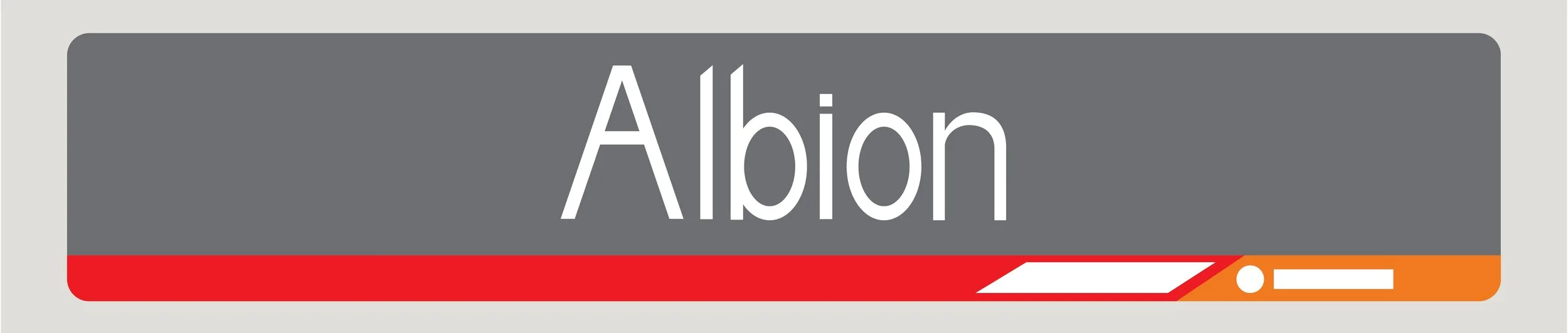
Railway Typeface
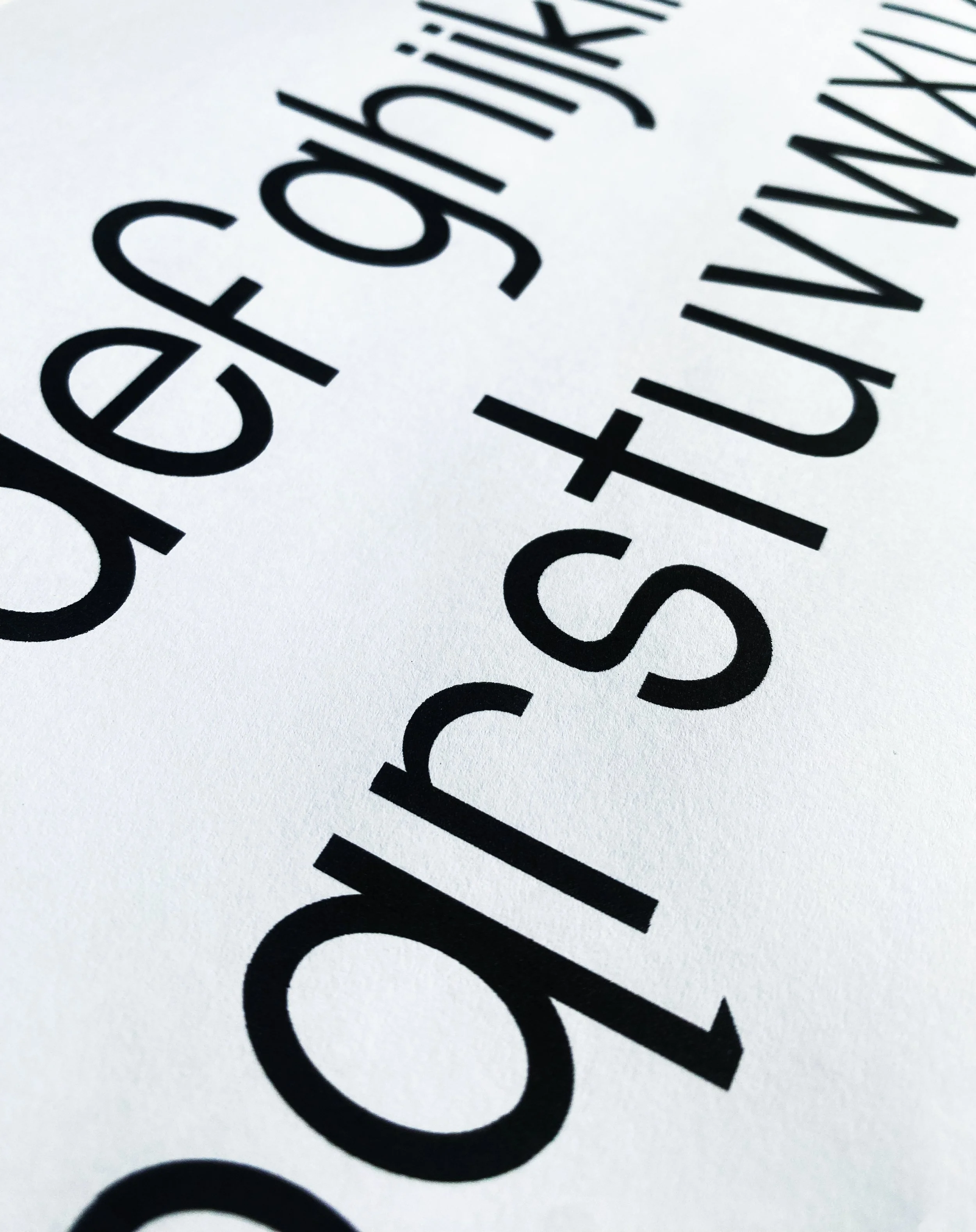
Throughout the Queensland Rail network, visual cohesion and adherence to accessibility is lacking and inconsistent. Aiming to improve these issues, the ‘New Rail’ Display Font emphasises clean geometric proportions and balanced letterforms. Designed specifically for high legibility across printed collateral and sign systems such as the many name boards through the network, the font delivers a minimalist visual identity.
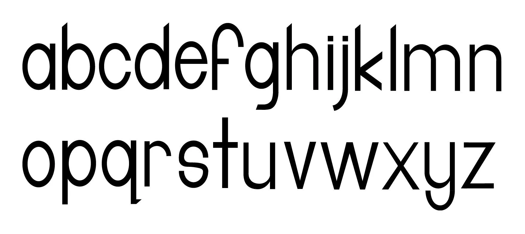
Full Typeface